SubwayIn-restaurant & Digital
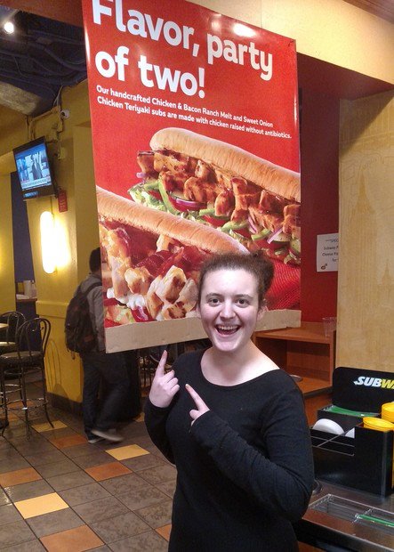
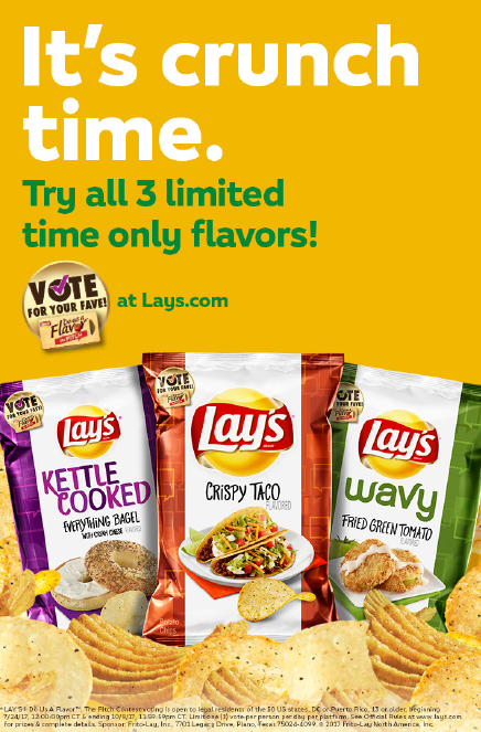
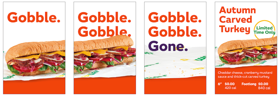
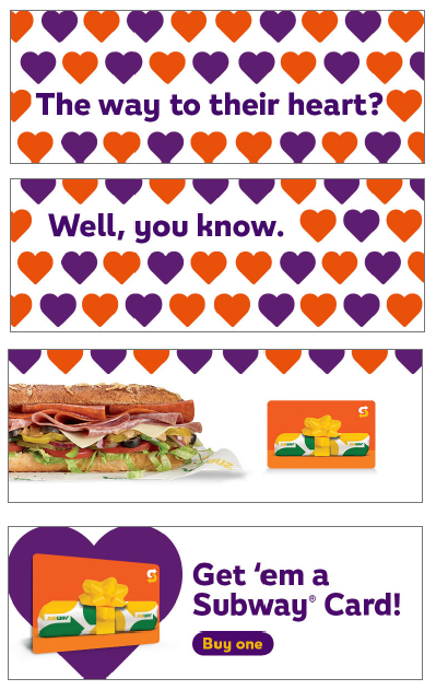
In the couple years I worked on Subway, they went through a few changes. Here’s some of what I wrote and concepted for in-restaurant and digital assets, sorted by each phase in the brand’s evolution.
I got paid to write puns about sandwiches.
It was awesome.
Post-Jared
After the “eat fresh” era came to an end, Subway got a new look. Highly stylized photography, bright color blocks, and the first change to their logo in over a decade. However, their audience of mostly middle-aged moms didn’t change, so they maintained a lighthearted tone.

“Hey, I wrote that!”
/background(fff)/960x1129.jpeg?auto=webp)

"So much sandwich."
A foot of sandwich is a lot of sandwich. The second brand iteration I worked on leaned in to the a-lot-ness of the subs with a “smart-dumb” voice aimed at a “bro-llennial” audience.
/background(fff)/960x1129.jpeg?auto=webp)


"MAKE IT WHAT YOU WANT"
It’s in all caps not because I’m yelling at you, but because the third re-brand had something to say: millennials don’t just take what they’re given, they make it what they want. In life, and in food. This bold new attitude begot short, punchy headlines with a clever twist.
/background(fff)/960x960.jpeg?auto=webp)
/background(fff)/960x436.jpeg?auto=webp)
/background(fff)/960x960.jpeg?auto=webp)
/background(fff)/960x1129.jpeg?auto=webp)
/background(fff)/960x436.jpeg?auto=webp)